Wardrobe & Styling
Color
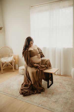
The colors you choose for your outfits are a reflection of both your family and your story. They should help you both stand out and blend in. The location of our session plays a big factor in choosing your colors. Outdoor sessions are lovely with warm, earthy, vibrant colors that play off the time of year whereas in studio or at home is perfect with neutrals and pops of soft tones.
Colors should not be too matching but rather complement each other. Mixing in neutrals will help with too much color overload and help keep family members from wearing the exact same colors.
Texture & Patterns
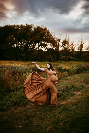
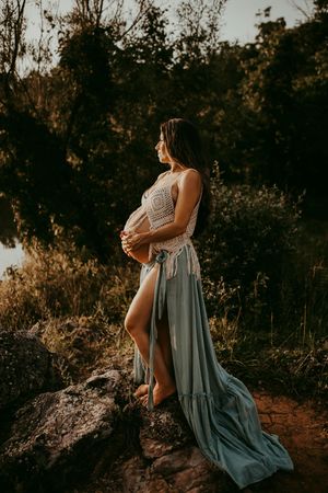
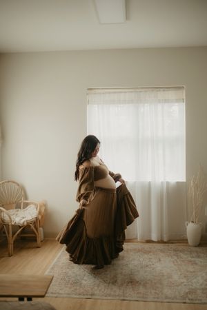
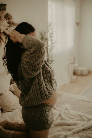
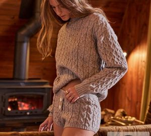
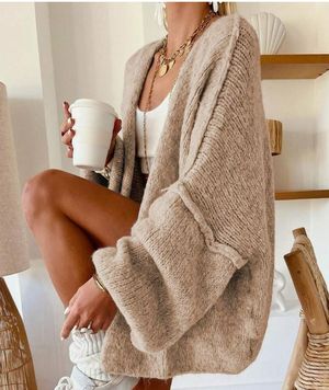
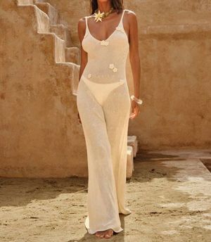
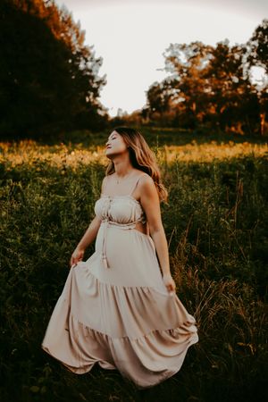
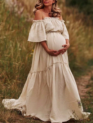
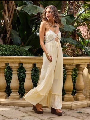
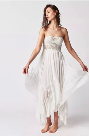
Textures and patterns help add movement, dimension and visual interest to your images. Examples of different textures include chunky sweaters or cardigans, long flowy dresses, linens and gauze, velvet, fringe, statement jewelry like necklaces and bracelets. Mixing these throughout your family can add so much visual appeal.
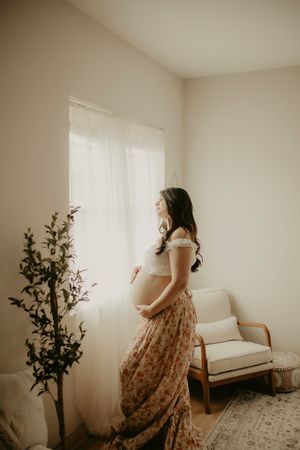
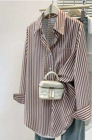
Patterns are also a beautiful way to add more detail and interest. As a general rule, one of every 3 family members should be in a pattern. Medium size patterns are a favorite. Think stripes or florals which are so perfect.
Layers
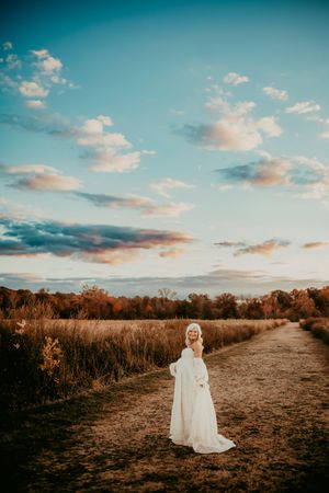
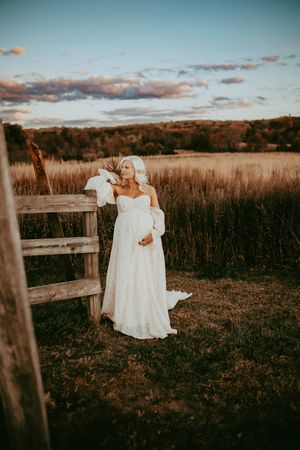
I adore adding layers for even more depth and visual interest. Adding layers gives an immediate sense of coziness and warmth to your images. Cardigans, blankets and chunky scarves worn off the shoulder look great. Open button up shirts, overalls and vests are perfect for men or boys.
Skin
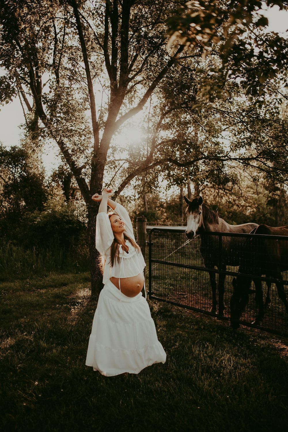
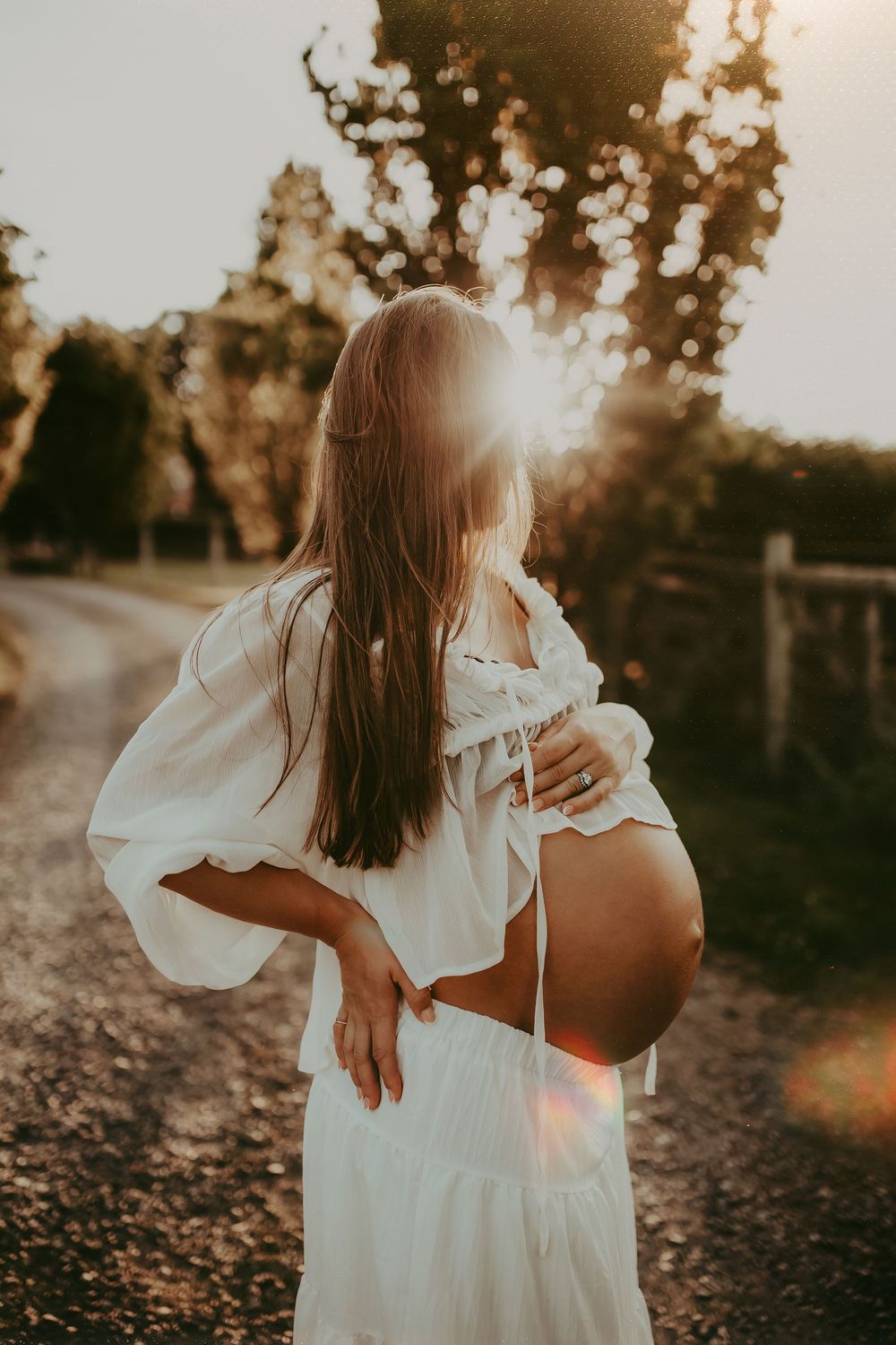
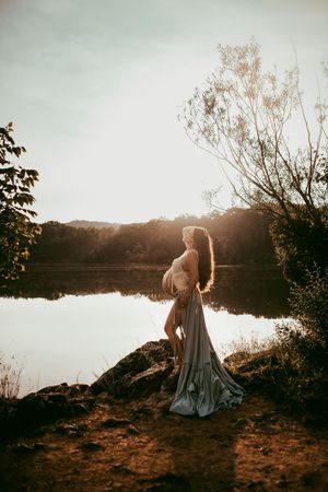
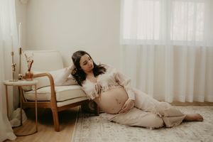
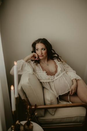
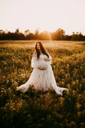
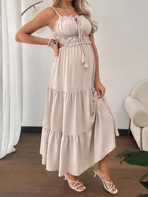
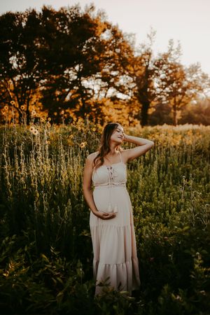
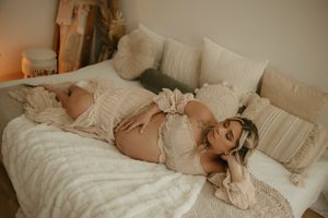
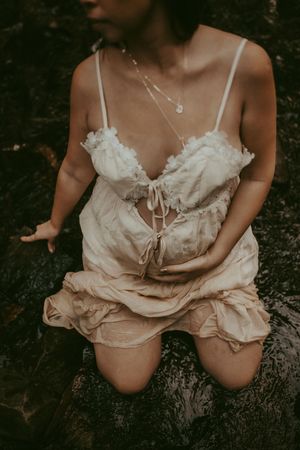
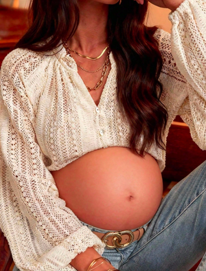
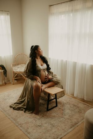
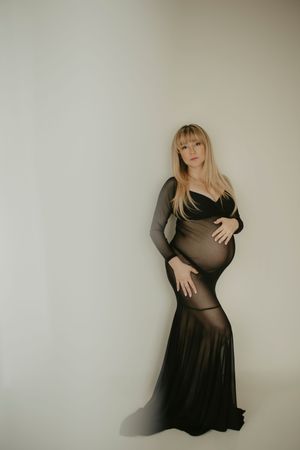
Where layers add a sense of coziness, exposed skin adds intimacy. You can show as much skin as you are comfortable with. Bare bellies are gorgeous in maternity sessions and differing levels of exposed skins can be mixed throughout. Think shirtless toddlers for beach or stream sessions or off shoulder tops or crop tops in warm weather locations.
Contrast
To avoid too much monochrome, contrasting colors are an easy way to help and yes, add visual interest. For example, if mama is in a dark colored dress, dad should be in a lighter tone and baby in a medium tone. It is all about the interest and varying color degrees within the family and based on who you are likely to stand most by. Kids can be in mixes of both or opposite (light on top, dark on bottom or vice versa).
Tips for Dressing & Styling for Fall
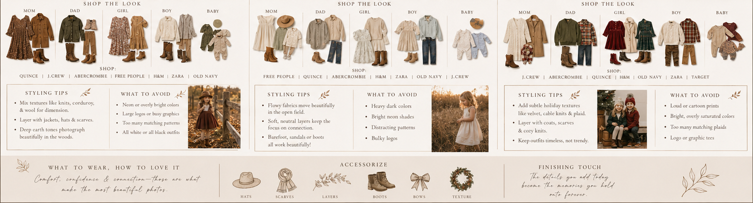
Embrace the fall palette. Choose warm, earthy tones that complement the beautiful foliage.
Neutrals: cream, beige, gray, taupe
Earth tones: camel, rust, terracotta, mustard, olive, sage
Deep jewel tones: burgundy, forest green, navy, plum
Accent colors: burnt orange, golden yellow, copper
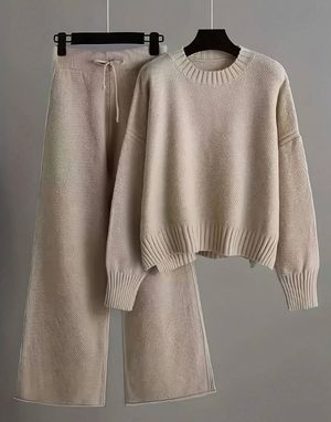
Play with textures. Textures make photos look more dynamic and cozier. Chunky knits, ribbed sweaters, corduroy or velvet, suede, leather; all perfect choices in fall. Mix and match with wool coats and scarves and flowy fabrics like chiffon for softness and movement.
Coordinate but don't match. Build a color palette and coordinate each person around that. Base neutrals, one or two warm earth tones and a deeper grounding color. Families should look cohesive but not uniform.
Layering and movement. Layers add interest and give options. Outfits with movements are visually interesting. Choosing to mix these two elements is key. Add accessories like wide-brim hats, delicate jewelry, ruffle socks or knee highs, hair accessories, ect.
Favorite stores for photoshoot looks: Zara, H&M, Free People, Old Navy, Abercrombie, Worth Collective
Client Closet
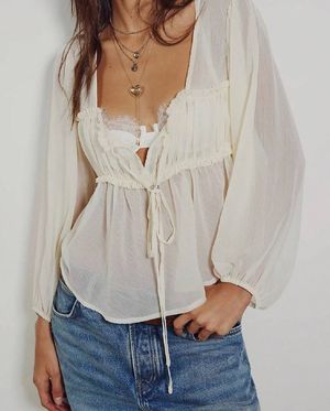
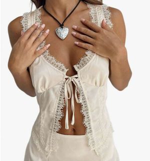
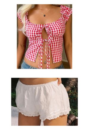
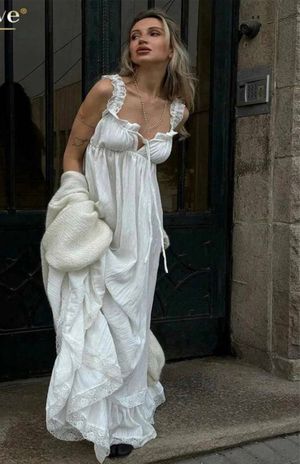
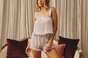
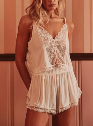
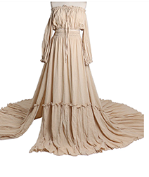
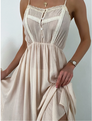
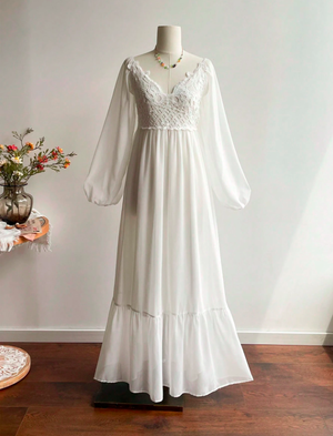
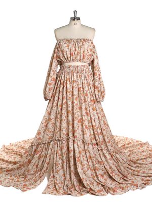
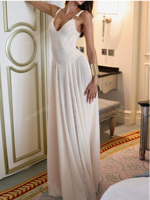
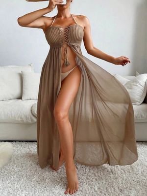
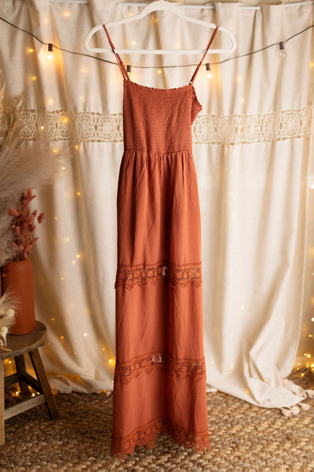
Below are many items for women. I do also have dresses and outfits for boys, girls and baby and some for men as well. Not all maternity body suits are shown as well as posing fabrics. Additionally, more ideas can be found on my Amazon storefront Brittnee Hagerty's Amazon Page